Mochi Food Delivery App
by Irene Tamayo
Project Overview
The product:
Mochi app is a food delivery app that helps busy individuals to order their desired food from their favorite restaurants quickly and easily.
Project duration:
May 2021 to Aug 2021

Problem and Goal
The problem:
Busy working professionals have no time to prepare food and to go outside from their office or homes.
The goal:
Design food delivery app that allows users to easily order food from their desired restaurant.
My role:
UX designer designing an food delivery app from conception to delivery.
Responsibilities:
Conducting interviews, paper and digital wireframing, low and high-fidelity prototyping, conducting usability studies, accounting for accessibility, and iterating on designs.

User Research: Summary
I conducted interviews and created empathy maps to understand the users I’m designing for and their needs. A primary user group identified through research was working adults who don’t have time to cook meals.
This user group confirmed initial assumptions about food delivery apps, but research also revealed that time was not the only factor limiting users from cooking at home. Other user problems included obligations, budget, health issues, lack of cooking skills or challenges that make it difficult to go out, to prepare meals or go to restaurants in-person.

User Research: Pain Points
These are the following pain points that we have gathered during our study about other food delivery apps.

Persona: Vince
Problem statement:
Vince is a freelance designer who is busy and no time to cook. Aside from that, due to the pandemic, he is avoiding large crowds outside but wants to buy food from restaurants.

User Journey Map
Mapping Vince’s user journey revealed how helpful it would be for users to have access to a dedicated food delivery app.

Paper Wireframes
The goal is to have the important elements in a home page which includes the profile, menu, search bar, call to action buttons, banner ad and lots of images.

Digital Wireframes
As the initial design phase continued, I made sure to base screen designs on feedback and findings from the user research.

Digital Wireframes
Easy sharing option, input of delivery details and other important links and icons for easy navigation in addition to equipping the app to work with assistive technologies.

Low-fidelity Prototype
Using the completed set of digital wireframes, I created a low-fidelity prototype. The primary user flow I connected was building and ordering food, so the prototype could be used in a usability study.
View the Mochi app:
Mochi Low-fidelity prototype

Usability Study: Findings
I conducted two rounds of usability studies. Findings from the first study helped guide the designs from wireframes to mockups. The second study used a high-fidelity prototype and revealed what aspects of the mockups needed refining.

Mockups
Early designs have name and price of item. After the usability studies, I added more details of the item and I also revise the design for clarity of item details.

Mockups
The second usability study revealed confusion and dissatisfaction in the checkout flow. I added other payment option since the design was only made for paying using credit card.

Mockups
These are some of the mockups for Mochi app.

High-fidelity Prototype
The final high-fidelity prototype presented cleaner user flows for ordering food and checkout.
View the Mochi app:

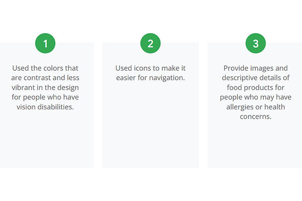
Accessibility Considerations
These are the following accessibility considerations after receiving feedbacks from the participants.
Takeaways
The following are the impact and lessons that I learned during the process.

Next Steps
These are the next steps that I will do to improve the design.

Let's Connect!
Thank you for your time reviewing my work on the Mochi app! If you’d like to
see more or get in touch, my contact information is provided below in this site.
