Pet Care
by Irene Tamayo
Project Overview
The product:
Pet care is an animal shelter that helps unfortunate animals to be adopted and also pet adopters find their desirable pets here. Pet Care’s goal is to make the adoption process fast and easy through online without the need to go to the shelter many times.
Project duration:
August 2021 to September 2021

Problem and Goal
The problem:
Available animal shelter websites have cluttered designs, lack of images and information about pets, inefficient systems for browsing through pets, and confusing and time consuming adoption process.
The goal:
Select and adopt a pet from an animal adopting website to be user-friendly by providing clear and easy navigation and offering a fast adoption process.
My role:
UX designer leading the Pet Care website design
Responsibilities:
Conducting interviews, paper and digital wireframing, low and high-fidelity prototyping, conducting usability studies, accounting for accessibility, iterating on designs and responsive design.

User Research: Summary
I conducted user interviews, which I then turned into empathy maps to better understand the target user and their needs. I discovered that many target users were working adults and treat adopting pets online as an easy and fast way to select and adopt a pet without the need of visiting the animal shelter many times. However, many pet adoption websites are overwhelming and confusing to navigate, which frustrated many target users. This caused a normally easy experience to become challenging for them, defeating the purpose of saving time and money.

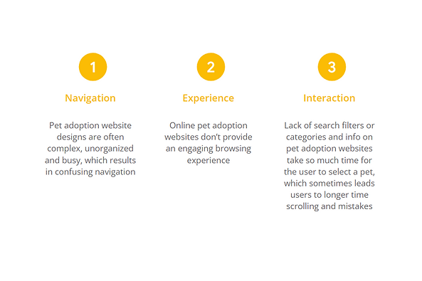
User Research: Pain Points
These are the following pain points that we have gathered during our study about other animal adoption websites.
Persona: Yumi
Problem statement:
Yumi is a busy and animal lover HR specialist who needs a website to adopt from a shelter because she wants to pick up the right pet by visiting the shelter only once.

User Journey Map
I created a user journey map of Yumi’s experience using the site to help identify possible pain points and improvement opportunities.

Sitemap
Difficulty with website navigation was a primary pain point for users, so I used that knowledge to create a sitemap.
My goal here was to make strategic information architecture decisions that would improve overall website navigation. The structure I chose was designed to make things simple and easy.

Paper Wireframes
Next, I sketched out paper wireframes for each screen in my website, keeping the user pain points about navigation, browsing, and adoption process flow in mind.
The home screen paper wireframe variations to the right focus on optimizing the browsing experience for users.

Paper Wireframe Screen Size Variation(s)
Because Pet Care’s customers access the site on a variety of different devices, I started to work on designs for additional screen sizes to make sure the site would be fully responsive.

Digital Wireframes
Moving from paper to digital wireframes made it easy to understand how the redesign could help address user pain points and improve the user experience.
Prioritizing useful button locations and visual element placement on the home page was a key part of my strategy.

Digital Wireframe Screen Size Variation(s)
I also created designs for additional screen sizes to make sure the site would be fully responsive.

Low-fidelity Prototype
To create a low-fidelity prototype, I connected all of the screens involved in the primary user flow of selecting a pet to checking pet’s profile and to adopting process.
At this point, I had received feedback on my designs from members of my team about things like placement of buttons and page organization. I made sure to listen to their feedback, and I implemented several suggestions in places that addressed user pain points.

Usability Study: Parameters
I conducted a usability study in my country with 5 participants.

Usability Study: Findings
These were the main findings uncovered by the usability study:

Mockups
Based on the insights from the usability study, I made changes to improve the adoption flow. One of the changes I made was adding the option to add more pets using a simple “+” option. This allows users to have more freedom to add more pets to adopt if ever they want more than one.

Mockups
To make the appointment flow even easier for users, I decided to make it automatically enters the user’s email address once log in than having it to input repeatedly every forms.

Mockups: Original Screen Size
Desktop Size

Mockups: Screen Size Variations
I included considerations for additional screen sizes in my mockups based on my earlier wireframes. Because users shop from a variety of devices, I felt it was important to optimize the browsing experience for a range of device sizes, such as mobile and tablet so users have the smoothest experience possible.

High-fidelity Prototype
My hi-fi prototype followed the same user flow as the lo-fi prototype, and included the design changes made after the usability study, as well as several changes suggested by members of my team.
View the Pet Care high-fidelity prototype

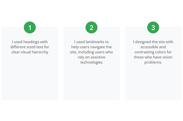
Accessibility Considerations
I also applied the accessibility standards to my design for diverse users.
Takeaways
Impact:
Our target users shared that the design was intuitive to navigate through, more engaging with the images, and demonstrated a clear visual hierarchy.
What I learned:
I learned that even a small design change can have a huge impact on the user experience. The most important takeaway for me is to always focus on the real needs of the user when coming up with design ideas and solutions.
Next Steps

Let's Connect!
Thank you for your time reviewing my work on the Pet Care website! If you’d like to
see more or get in touch, my contact information is provided below in this site.
